Thursday, 24 May 2018

Model Portfolio and info on locations used


Name: Shameer Qureshi
Age: 18 years old,
Height: 5'7
Colour of eyes/hair: Brown eyes, jet black hair

Description: Average hight considered for males so they can look at the type of outfit he wears to get a better understanding, clean shaven and smooth face with a very good and healthy beard,  great for close ups, mid shots and rule of 3


Name: Callum Peterkin
Age: 18 years old
Height: 6'1
Colour of eyes/hair: Brown eyes, brown Hair
Description: Muscular stocky build, good to show off jackets w/other outfits with this model and certain hats will stand out more with this model. Consider using mid/long shots, rule of 3 and camera angles that feature higher angles to show of more of the head (for hats etc.)


Name: Kevin Ola
Age: 18 years old
Height: 6'4
Colour of eyes/hair: Dark brown eyes, black hair
Description: His height is at the top of the spectrum for the average male height and this helps to appeal to the taller side of the target market and make them feel welcome. Athletic muscular build, great for outfits that feature short sleeve T-shirts, sweatshirts an jackets, consider using mid-shots to really use emphasise the models features


Name : Colten Tuso
Age: 19 years  old
Height: 6'0
Colour of eye/hair: Dark brown eyes, brown hair
Description: Athletic average size build,clean and smooth face with a great smile good for pretty much any outfit, to take advantage of his features aim to use close ups and mid shots other camera angles will work but the one specified will have the best effect


Name: Kristin Kristilolu 
Age: 18years old
Height: 5'3
colour of eyes/hair: Brown eyes. dark brown hair
Description: Petite frame with an average bosom, very smooth face with a great smile and nice eyes,  to emphasise the models features provide outfits that compliment her body and frame, such as tight dresses, slim fit/high waisted jeans with crop tops. Consider using close ups, rule of 3, mid-shot and long-shots


Name: Danielius Grab 
Age: 18years old
Height: 5'10
Colour of eye/hair: Hazel, hot-toffee brown hair
Description: Slim frame, focus more on giving the model clothes that cover the body for example bomber jackets, light jackets etc.


Name: Jordyn Jacobs
Age: 18years old
Height:  6'7 
Colour of eyes/hair: Dark brown, black hair
Description: With his height he helps to reach out to the taller side of the target audience, he has an athletic frame and is average size, most out fits will suit, however try and avoid using jeans that are too skinny this will make him look too tall and skinny. Consider using camera angles that allow for the whole body in the shot.


Name: Johnmark Adaramola
Age: 18 years old
Height: 6'5
Colour of eyes/hair: Dark brown eyes. black hair
Description: Height allows an advantage to breach through to the taller side of the target audience, very muscular build, great for showing outfits that make the build of the body stand out E.g. muscle fit t-shirts/shirts, sweatshirts and jumpers that hug on to the body etc. Look to take advantage of his features using mid-shots and long shots mainly  


Name: Theo Nthoyiwa
Age: 25 years old
Height: 5'8
Colour of eyes/hair: Dark brown eyes, brown hair
Description: Very smooth and clean shaven face with a neat beard, he's got a muscular body build, to take advantage of his features consider utilising close up and mid shots 


Name: Ebony Brown
Age: 19
Height: 5'8
Colour of eyes/hair: Brown eyes, dark brown hair
Description: Average and curvaceous body more of an hour glass body, beautiful smile with a very smooth face, she works well with most outfits due to her body type, to take advantage of the models features give her outfits that hug her body a little more to make her stand out E.g. fashion nova ripped jeans (really good for showing off the bottom half of the body), below the knee dresses (sundresses etc.) etc. most camera angles will work well with this model


Name: Alana Marie
Age: 17
Height: 5'8
Colour of eyes/hair: Brown eye/ brown hair
Description: Slim and curvaceous body, amazing smile and nice eyes, she works well with outfits that are more on the smaller size E.g skinny jeans, short dresses but she also work well with big puffer jackets, consider using close ups and mid shots to really get the best picture with this model


Name: Semi Olukoya
Age: 19
Height: 5'10
Colour of eye/hair: dark brown eyes, black hair
Description: Average athletic body size, works well with the majority of outfits, very smooth complexion facial wise accompanied with a great smile, try to aim to use mid-shots with this model if you want to catch their best qualities in action but most camera angles will work with this model


Location used for my photoshoots:
Intu Lakside


Bluewater


Big Easy, Canary Warf


Hotel Samos, Magaluf


Onkell Residence, Antalya 


Chafford Hundred Gorge

Sunday, 20 May 2018

Website concept & layout

\
This is the first concept idea I made for my website:
With the first box i had the idea that i will use the picture i used on my front cover for the background image that will be one of the main focuses for the website. the idea for this was, based on the fact my audience who looks and reads my fashion magazine they will notice my website straight away and they wont be in doubt that they're on the wrong website.

i wanted to feature my slogan going across my background image with Goldish characters due to the fact my logo features a goldish/sandy yellow background.
Below my slogan i wanted to put a promotional rhetorical question that adds more hype t

i wanted to feature a slideshow of all the photos i took for my 16-19 cover photoshoot and next to it i will have text saying "follow the hottest trends"
At the bottom i would feature a link that would take them to my front cover and content page.

Comments:
i asked a few of my friends in the class to give their comment on my initial idea for the website and quite a few of them told me to distinguish how my home page would look like because looking at my plan it wasn't clear on if that was the home page.

Another comment that was made was about my background photo i wanted to use, they suggested that i make the boarder larger so that i can fit in the whole image and that way it allows my audience to see my models outfit.


This is the improvement to my initial idea for my website:
This is my final design for my website homepage, with the rest of my tabs it will feature the same layout as the homepage hence the reason why i have not decided sketch the other tabs.

i stuck with the same idea of keeping my two front cover photos as the main background image for the website homepage and the rest of the tabs.

i've made sure to tidy up the page so it looks more professional, the ways i have done this is through making the tab look more appealing and easier to navigate, i have also made the branding of the fashion website more professional by featuring and using more of the slogan and fashion magazine name. This way my target audience is more likely to remember my website and fashion magazine.

i have made sure that i have given a short brief on the businesses targets, aims and objectives so that my audience has a better understanding of what we are about.


This is the layout I have chosen for my website:
I plan to use the same if not similar layout throughout to keep it consistent and give my website a clean look

Improvements made after reflecting on the website:

After reflecting on the look and layout of my updated website i decided to make further improvements, such as changing the main colour scheme of the website to red/orange and also removing the coloured background for the section that talks about what the website is about.


As a result of this change, it compensates to the ideal layout i was trying to aim for in the sense that it now has a clean and consistent look.


Another improvement is that for the 'The Modern Feel' page I separated all the outfits i made my models wear into seasons rather than clumping them all up together, as a result this make it easier for my audience to navigate through our outfits and find the ones they like easier.


With this section in particular i included a comment made from one of our models who took part in modelling our outfits for us. however, i decided to do a video instead and that the audience will gain a better understanding of how the models perceived the outfits and the actual brand itself.


with the 'HypeBeast Feel' page I just adjust the layout of where texts were placed and just gave a little more explanation into what a "hypebeast" is and how it inspired the brand. i also featured the 'hot topic' and this was highly requested in the survey I conducted, so I provided a hot top on updates about what celebrities are wearing what and how they're wearing it


On the last page 'The Transitional Feel' is some what similar to "The Modern Feel" in the sense that this page includes a whole range of outfits that specifically target the smart-casual theme of things seeing as this page is mainly dedicated to the 20-24yr old target market. I have also tired to add questions that will lure this target market in seeing as when they first look at it, they may perceive the website to be dedicated towards the younger side of the market because of the types of outfits shown etc.


Friday, 18 May 2018

Aims for Front Cover @20-25yr olds

Concept ideas for the front cover:
 

My aim for the front cover:
With the cover aimed at 20-25 year olds I want the mise en scene used to be quite smart-casual and the reason I want this is because it can represent the transition most young adults go through, from wearing casual clothes having less responsibilities to transitioning to more formal or "adult-like" clothing because more responsibilities are starting to be pushed on them.
Within the requirements for the magazine, it does not say what type of lifestyle we should base our fashion magazine on, i want to try and aim to promote the lifestyle of entrepreneurship and innovation

My Vision for the front cover:
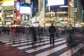
Im fixed on the idea of the model being the main focus and everything else around them is blurred, thats why I want to try and find a way to incorporate blurred traffic and the model together because i feel it has a strong message behind it. The message being that throughout life we are constantly changing and improving on ourselves and sometimes it gets to the point where we may focus on ourselves so much that everything that happens around us is like a blur. it usually starts to feel like this when we reach adulthood and our friends start having kids and start getting married and everything just happens so fast. I want to represent this in my front cover because it is very relatable but also with the mise en scene i will have, it will show that even though life may be a blur you're transitioning into your best-self and someone who you will proud to be.
I want to employ the Long-shot for this front cover so i can really capture the final picture i want. I may look towards using a green screen so that i can edit in the blurred traffic and give it a more nightlife effect. I'm leaning more towards this route due to the fact for me to actually take this image will be very hard to do and seeing as i have little experience with using time lapses and merging hem into a photo thats why i want to take that route.

My goals to achieve for the front cover:

  • Aim to edit the blurred traffic into the final picture with care and make sure it looks very close to the real thing
  • Make sure that the intertextuality used is not too complex to understand
  • Have fun when editing and taking the photos
This is the content page for the front cover of this magazine cover


This is the front cover, i was not able to meet one of my aims which was to try and edit blurred traffic into the background so it can play in hand with my ideal magazine idea.

Aims for Front Cover @16-19yr olds


Concept ideas for front cover: 


My aim for the final production of my magazine:
I aim to split my target audience into 2 front covers, cover 1 being aimed at 16-19 and cover 2 being aimed at 20-25yr olds. In terms of what models i intend to use for my front cover i'm not too sure yet but I'm sure as I dive deeper into taking these pictures i will decide on what i should use, whether they may be a male or female.
In terms of the mise en scene with the cover aimed at 16-19yr olds, I want the model to wear at least one piece of branded clothing, the reason for this is because it will play along with the concept I want to feature in the picture.

my vision: For my first front cover aimed at 16-19years, i want to focus on the idea of how the current generation are now finding careers by promoting brands with picture they post on their social media. I want my model to be wearing clothes modern clothing (doesn't matter what trend the outfit may follow) and preferably have a piece of clothing which is branded because when taking the photos i can use that brand piece(s) of clothing as my point of emphasis for the photo.
I also want to include intertextuality that the current generation can relate to and that would be constant criticism and negative opinions of how teenagers are always on their phone/social media, they don't pay enough attention to their education because they're on their phone all the time etc. The way I would represent this intertextuality is by editing dark clouds closing in on the lighting or rain droplets falling.
In terms of lighting and how i would play around with it, i want to try and aim to take the picture when the sunlight is just coming out of its peak so that it does not make my photo contrast too bright or if the weather doesn't plan out how i want it to then i will take the picture in doors manipulating the lighting so i can get the desired lighting i want. i also want to try and edit a few things into my photo, so I may look to use a green screen but if not then i will take to photo shop and try and edit in a sun rise/sun set because this would represent how the desired goal our current generation is trying to aim for is an uncertain road and when you approach your goal you may find out that it will actually lead you to a professional death leaving you stranded and you would have to find a new goal to aim for. whereas the sun rise would represent how that goal you aim to achieve will actually take you to larger heights and make you shine into something thats bigger than you dreamed of.
I intend to either use a mid-shot or long shot to feature in my final front cover photo.

My targets to achieve for the final picture:

  • Intertextuality is closely linked to my target audience (16-19yrs)
  • Make sure all the mise en scene that is included is necessary 
  • The final edits of the final photos taken are precise and portray the message im trying to give out


1st picture taken trying to replicate the ideal examples:
 As you can see the picture i have taken is quite if not very similar to the ideal examples, this is the sort of feel i want to go for when i take the final picture for my front cover aimed at my youngest target audience (16-19yrs).
I then used this same image but added a filter to it to give it more a unique feel to the picture
This has made my vision for the final cover photo aimed at 16-19yr olds more vivid due to the fact i already know what i want my final photo to look like this just gives me more of an insight into how i should edit it on the photoshop and anything i may need to add
This time i have taken to photoshop and edited a Stone Island logo onto my models jumper and i have also played around with the brightness and contrast to make it look like its a sunny day.


 This is my content page for this magazine cover